Visualizing millions of Instagram posts with ggplot2 and gganimate
14 Feb 2016A while back, for a research paper that investigated the relationship between location data and demographics, I obtained metadata for around 16 million Instagram photos. These photos included the latitude-longitude at which the photo was taken. Since then I’ve wanted to take a closer look at the geography of these photos. My friend Dave recently came out with an R package gganimate that makes it easy to create animations, so I decided to visualize the geographic growth of Instagram over time. In this post I’ll describe the small amount of code needed to make an animated map with ggplot2 and gganimate.
Installing gganimate
The first step was to open up RStudio and install gganimate. As the instructions on the github dictated
# Note: you will need devtools installed for this to run
# Only need to do this once.
devtools::install_github("dgrtwo/gganimate")
Loading libraries and data cleanup
After gganimate is installed, we load in our libraries.
library(dplyr)
library(ggplot2)
library(gganimate)
library(mapproj)
library(RColorBrewer)
Next, I loaded in the data:
df = read.csv("../data/photo_gps_time.csv",
              header=FALSE,
              col.names = c("lat", "lon", "t"))
My first visualizations broke because a small number of data points had longitudes on the order of thousands, for some reason. Longitudes can only be between -180 and 180, so these were simply broken points. Since there were only around 40 of these points (out of millions), I just filtered these out and didn’t investigate any further. Additionally, I converted my timestamps to a time object R can understand. Finally, I filtered out the last incomplete month of the dataset, which was September, 2013.
df <- df %>% filter(-180 < lon, lon < 180)

df <- df %>% mutate(ts=as.POSIXct(t, origin="1970-01-01"),
                    year_month=format(ts, "%Y-%m"))

df <- df %>% filter(year_month < "2013-09")
Because my data frame is fairly large, it will take a long time to make any visualization with it. I wanted to iterate quickly, so I made a smaller, sampled version which I could easily play with.
small <- df %>% sample_n(1e5)Code: Quick version
First, I used ggplot2’s borders function to make a map of the world layer. Later, we’ll draw a heatmap on top of this.
# create a layer of borders
mapWorld <- borders("world", colour="gray50", fill="gray50")
Now, to get some idea of what the final version will look like, I did a quick plot:
small %>%
ggplot(aes(x=lon, y=lat)) +
mapWorld +
geom_bin2d(alpha=0.7) +
scale_fill_gradient(low="blue", high="hotpink", trans="log")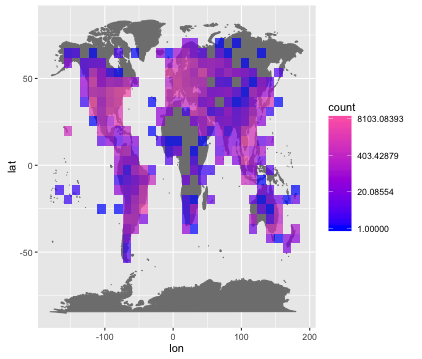 Note that I’ve lowered the alpha value from 1 so that we can see the geography underneath each bin, and that I’m using a log scale for coloring.
Turning this into an animation is super easy with gganimate. We simply add a “frame” value in our original aesthetic, save the output of ggplot, and input that to gg_animate.
p <- small %>%
  ggplot(aes(x=lon, y=lat, frame=year_month)) +
    mapWorld +
    geom_bin2d(alpha=0.7) +
    scale_fill_gradient(low="blue", high="hotpink", trans="log")

gg_animate(p, "output1.gif")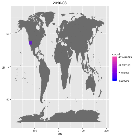
Code: Final version
This is a good start, but there a number of fixes to make. We should…
- Change the color scheme to be more vivid
- Set the numbers on our legend to something more human-friendly
- Get rid of the axes and grid
- Fix the distorted way the map is currently appearing
- Speed up the animation
For the colors, we’ll use some nice ones from RColorBrewer. To get rid of the grid and axes, I’ll use a version of Dave’s theme_blank. The rest of the changes take only a line or two and are noted in the comments.
theme_blank <- function(...) {
ret <- theme_bw(...)
ret$line <- element_blank()
ret$rect <- element_blank()
ret$strip.text <- element_blank()
ret$axis.text <- element_blank()
ret$axis.title <- element_blank()
ret$plot.margin <- structure(
c(0, 0, -1, -1), unit = "lines",
valid.unit = 3L, class = "unit")
ret
}
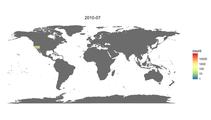
p <- df %>%
ggplot(aes(x=lon, y=lat, frame=year_month)) +
mapWorld +
geom_bin2d(alpha=0.7) +
scale_fill_gradientn(
colors=rev(brewer.pal(7, "Spectral")), # 1. Nice colors!
trans="log",
breaks=c(1, 10, 100, 1000, 10000)) + # 2. Human-friendly
theme_blank() + # 3. Get rid of axes and grid
coord_fixed() # 4. Fix map distortion
gg_animate(p,
"output_final.gif",
interval=0.5, # 5. Speed up animation
ani.width=700, ani.height=400)The final result:
Observations
An animation like this one is more for fun than it is for serious analysis. However, there are some interesting observations we can make:
- Instagram is impressively global.
- Instagram started globally. In the first month of its launch, October 2010, we can see many posts in the US, Europe, Asia, and Australia.
- Android release. There’s a large jump in the number of photos in Africa in April, 2014. This could be caused by Instagram launching an Android version in that month. Android has a much higher market share than iPhone in Africa.
- At the end of the data, there are very high numbers of photos in America, Western Europe, Southeast Asia, Oceania, and Brazil.
Conclusion
In conclusion, ggplot is awesome and gganimate makes creating animations super easy. My code (without the data, for now) is available here on github.
I hope you enjoyed this first post! If you’re interested in me writing about something else or have a question, please write me an email, leave a comment, or contact me on twitter.