What I Talk About When I Talk About Graphs
17 Jun 2020If you’re reading this blog then you, like me, are probably something of a nerd. Nerds get lots of training in our nerdy things, like machine learning, R, and Python, but not as much training in communication. Today I’m going to share some quick advice on how to describe graphs, especially in a presentation. I’ll then show an example of how you might apply this advice in practice.
This advice originally comes from my Ph.D. adviser, Augustin Chaintreau, who got it somewhere else, who got it somewhere else, leading back to Euler or someone.
One Weird Trick to Explaining Graphs
- Describe the X axis.
- Describe the Y axis.
- Explain any differences in colors, lines, geometries, etc.
- (Optional) Describe an example.
- Add a giant red circle or line or whatever illustrating the main point.
- Display giant red text that state the main point of the graph.
A lot of caveats apply to this! Your presentation always should be adjusted based on your audience– audiences that are used to looking at certain types of graphs may need less explanation, less technical audiences may appreciate simpler graphics, etc. And no, the giant red circle doesn’t have to be red.
If you find that you can’t follow this advice, and your audience isn’t highly sophisticated, it might be a sign that the graph is too complicated and you should use a different one or describe your results in a different way.
Example
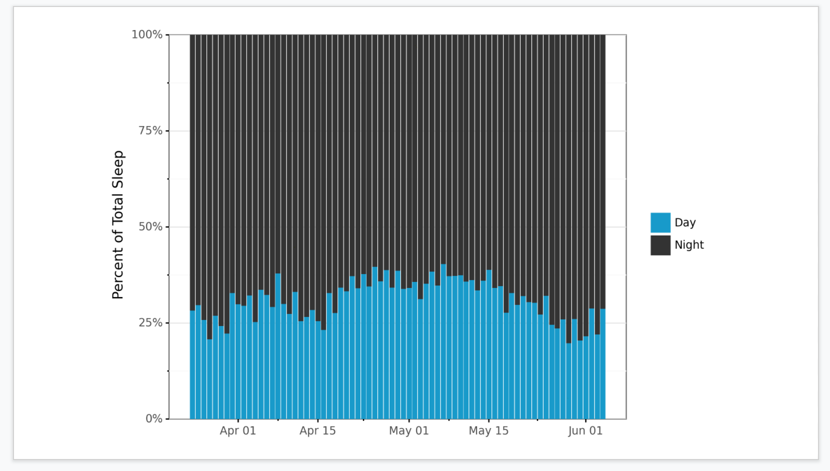
To illustrate this, I’ll use a simple example using a plot of baby sleep times from last week’s post.
After displaying this, I might say:
- “The X axis represents time, with each band signifying a day.”
- “The height of the bars on the Y axis shows the percent of all sleep time, so it ranges from 0 to 100%.”
- “The color of the bars represents night and day, with black representing night and blue day.”
- “For example, in the leftmost bar, we see that of Baby’s sleep that day, a bit over 25% was during the day.”
And now, time for that big ugly emphasis:
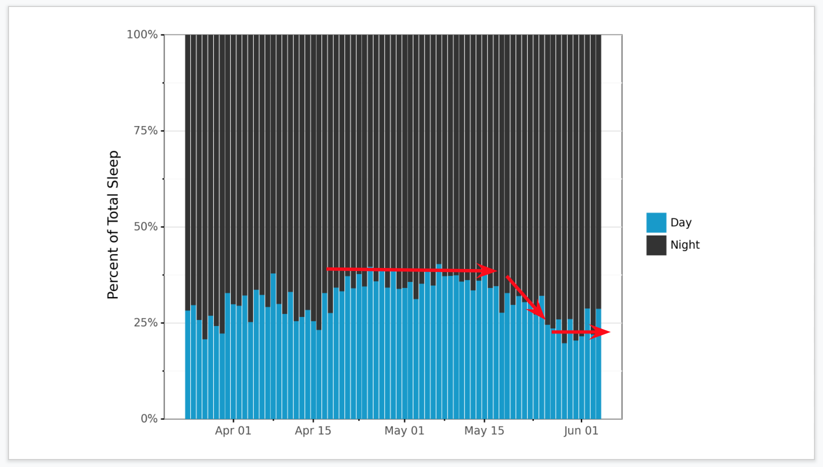
I like to leave a beat for people to look at the lines and ponder for a few seconds, and then:
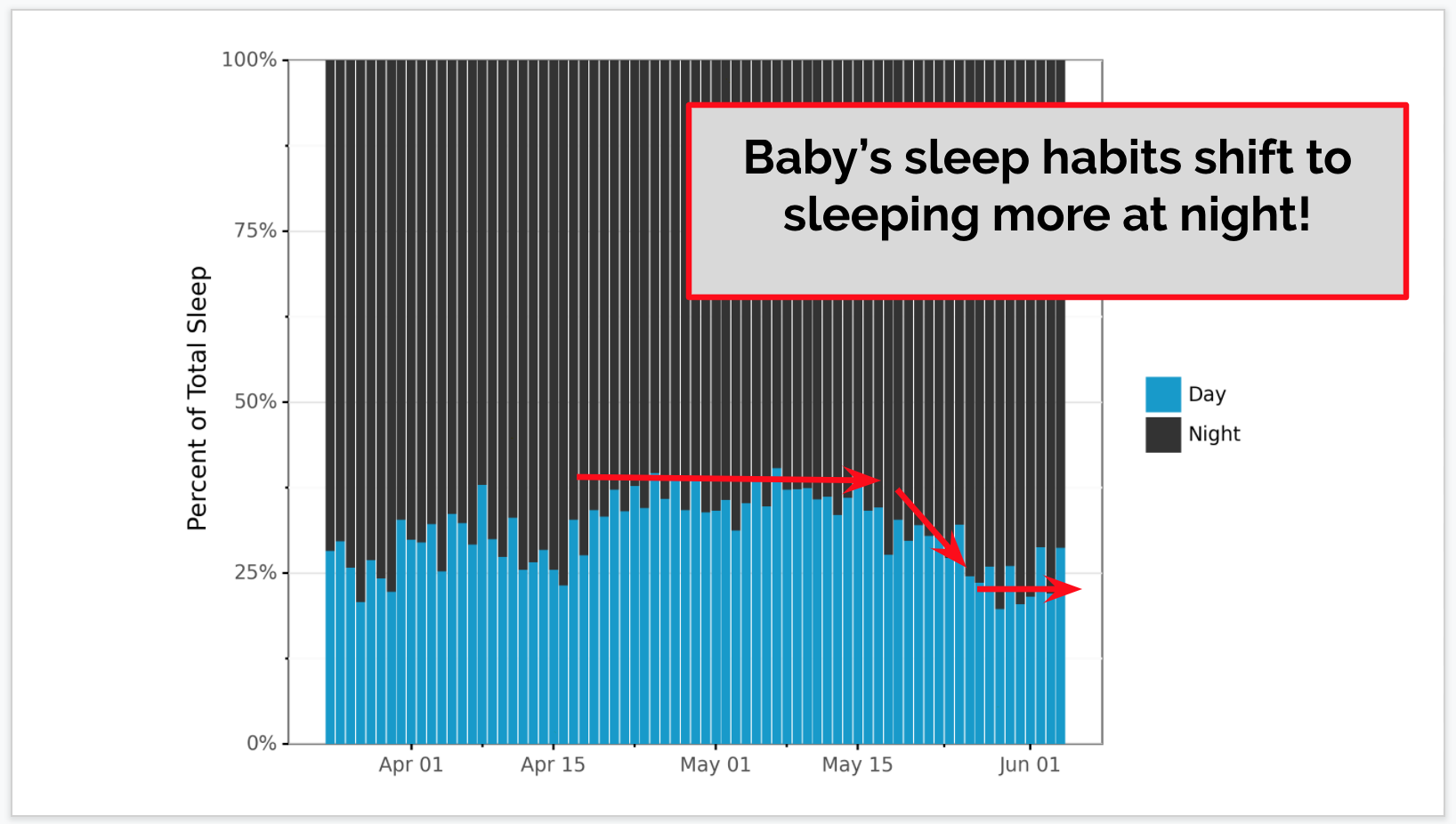
“Baby’s sleep habits shift to sleeping more at night!” I’m usualy against saying exactly the text on a slide, except in points of emphasis, like this one. I’ve put the example Google slides here.
Honestly, if I really wanted to do a good job showing this data, I should have made a simple line graph showing percent of time asleep during the day. Maybe less pretty, but much clearer.
Conclusion
You now know my 6 simple steps to talking about graphs. I hope they are useful!