Night and Day, Python and R: Baby Sleep Data Analysis with Siuba
10 Jun 2020This is part of a series on visualizing baby sleep data with Python and R. All code is in this repository.
- Visualizing Baby Sleep Times in Python
- Recreating the ‘Most Beautiful Data Visualization of All Time’
- Night and Day, Python and R: Baby Sleep Data Analysis with Siuba
More Baby Sleep Data!
I’ve continued to have fun graphing my baby’s sleep times with data recorded from her fancy bassinet. We’ve had some… interesting… experiences learning about our infant’s sleep patterns and how they change over time. The plots today show the shift from our baby’s time napping to time sleeping at night.
Previously, I visualized our baby’s sleep times in Python and made a pretty image using R. This week, I’ll confuse the heck out of everyone by using Python libraries that bring R’s great ideas to Python. Will this be a beautiful moment of cross-programming-language unity? Will it just be confusing for everyone? Read on to find out!
Specifically, I’m going to use siuba, a data manipulation library heavily inspired by R’s dplyr. I’ll also use plotnine, a plotting library that clones R’s ggplot2. I’ve always found Python more enjoyable for programming and R more enjoyable for data analysis, and I’m excited to see R’s ideas brought to Python.
This post is broken up into two parts:
- Part 1 shows the plots and describes them, no programming involves.
- Part 2 walks through the code in detail.
Plots
Details
Enough of looking at pretty plots… how did we make them?
Data Manipulation: Pandas, Dplyr, and Siuba
Before we dive into the code, I’ll mention that this code will look weird to Python programmers and eerily familiar to those who use R’s dplyr.
Some day in another post I’ll break down why I like R’s dplyr library and how learning it made me a better data scientist!
The 5 minute summary is that most data manipulation only uses a few crucial operations.
Dplyr (and it’s Python equivalent, siuba) break these operations into a few functions that operate on a dataframe:
mutate: add a new columnselect: select a subset of columnsfilter: select a subset of rowsarrange: sort your dataframegroup_by: apply the next operations only by groupssummarize: collapse groups into summary statistics
These operations can be done in pandas (there are many websites comparing pandas and dplyr).
I like dplyr because a few features make my coding closer to “speed of thought.”
In dplyr and siuba, a dataframe is piped thorugh a series of the above commands, in siuba using the >> operator.
The _ variable is used to refer to the current dataframe in the pipe.
This makes it easy to manipulate a dataframe in multiple ways in one statement without having to make and keep track of multiple variables.
If this all feels a little fuzzy, please take a look at the code below, and stay tuned for some future love-letters to R :).
I should mention that I attempted to port dplyr to python as well, with the dplython library, however, due to fatherhood and a fulltime job I haven’t put much time into dplython recently, and I’m happy to see siuba exists!
Okay, now let’s actually dive into the code.
Preliminaries
import datetime

import numpy as np
from palettable.lightbartlein.diverging import BlueGray_2
import pandas as pd
from plotnine import *
from siuba import *


COLOR_VALUES = BlueGray_2

TIME_07_59_AM = datetime.time(hour= 7, minute=59, second=59)
TIME_07_59_PM = datetime.time(hour=19, minute=59, second=59)
TIME_11_59_PM = datetime.time(hour=23, minute=59, second=59)

# first, run
# pip install snoo
# snoo sessions --start START_DATE --end END_DATE > all_snoo_sessions.csv
df = pd.read_csv("all_snoo_sessions.csv")


# Convert to pandas datetime.
df["start_datetime"] = pd.to_datetime(df["start_time"])
df["end_datetime"] = pd.to_datetime(df["end_time"])
First we have imports and some constants.
You’ll notice the * imports, which isn’t typically good Python style.
However, it makes the code much less verbose and I think makes sense for data analysis style coding.
We load in our data and do some basic type conversion.
Splitting Time Periods
def split_times(df, time_to_split):
  df = df >> mutate(start_date = _.start_datetime.dt.date,
                    split_time = time_to_split)
  df["split_time"] = df.apply(lambda X: datetime.datetime.combine(X.start_date, X.split_time), axis=1)

  df_no_cross = (df >>
    filter(~((_.start_datetime < _.split_time)
             & (_.end_datetime > _.split_time))))
  df_cross = (df >>
    filter(_.start_datetime < _.split_time,
           _.end_datetime > _.split_time))

  df_cross_1 = df_cross.copy() >> mutate(end_datetime = _.split_time)
  df_cross_2 = (df_cross.copy()
    >> mutate(start_datetime = _.split_time + datetime.timedelta(seconds=1)))

  df = pd.concat([df_no_cross, df_cross_1, df_cross_2])
  df = select(df, _.start_datetime, _.end_datetime)
  return df


# Simplify dataframe and split at midnight, 7am, and 7pm.
df = select(df, _.start_datetime, _.end_datetime)
df = split_times(df, TIME_11_59_PM)  # Split timestamps that cross days.
df = split_times(df, TIME_07_59_AM)  # 12am - 7am is night.
df = split_times(df, TIME_07_59_PM)  # 7pm - 12am is night.
The split_times function tackles the same challenge we faced in my earlier post: how do we make sure a time period doesn’t cross midnight?
I’ve taken roughly the same logic as the previous post but using siuba syntax instead of vanilla pandas.
What the code is doing is the following:
- Create a new datetime column with date equal to the start time’s date, and time equal to the time we want to split on.
- Break dataframe into two new dataframes: one with sessions that cross the splitting time, and one with sessions that don’t.
- For sessions that cross the time, create two new dataframes. One will contain the first portion of the time period: original start time, ending at the splitting time. The other will have the second portion: start at the split time, end at the original end time.
- Concatenate all dataframes together.
- Profit.
Labeling Days and Nights
# Make columns for date and time of day
df["start_time"] = df["start_datetime"].dt.time
df["end_time"] = df["end_datetime"].dt.time
df["start_date"] = df["start_datetime"].dt.date
df["end_date"] = df.start_datetime.dt.date + datetime.timedelta(days=1)


# Add a "night" or "day" column based on time of day.
df = mutate(df, sleep_type = if_else(((_.start_time > TIME_07_59_PM)
                                      | (_.start_time <= TIME_07_59_AM)),
                                     "Night",
                                     "Day"))


# Convert start_time from datetime.time to datetime64 for plotting.
df["start_time"] = pd.to_datetime(df["start_datetime"].dt.time, format='%H:%M:%S')
df["end_time"] = pd.to_datetime(df["end_datetime"].dt.time, format='%H:%M:%S')
We add a few columns with just the time of day (not the full date and time) and convert to an easier format. Also, crucially, we label each time period with whether it took place at night or during the day. I’ve defined “night” as 8pm to 8am and “day” the opposite. This doesn’t align with most of my behavior most of my life, but works well enough for the baby’s schedule.
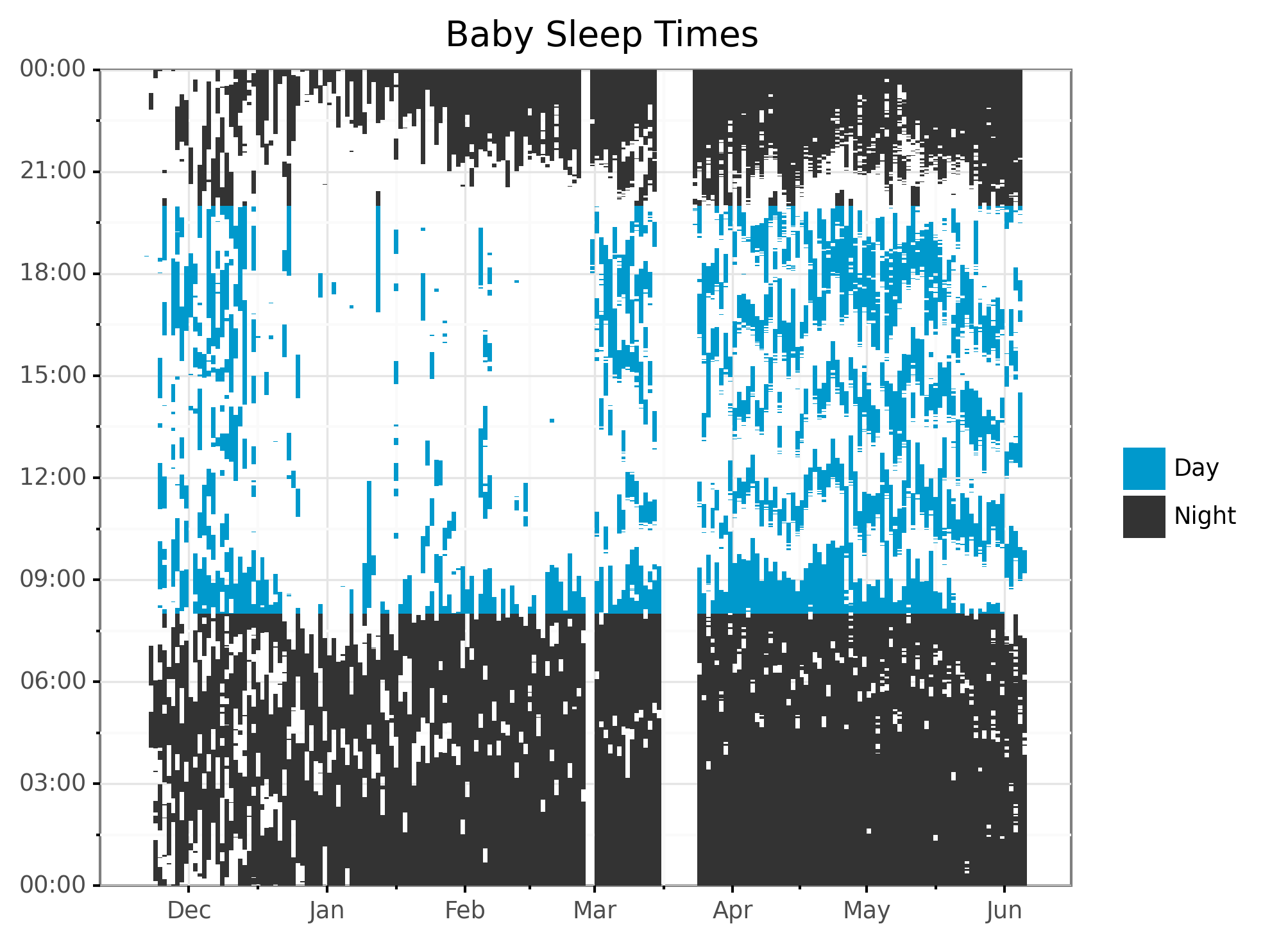
Check Plot
Next, I recreate a plot from the original post, but color the rectangles by whether the time is day or night. This is mainly to make sure I didn’t have any bugs!
# Plot sleep times by day, colored by time of day.
plot_rect = (
  ggplot(aes(), data=df)
  + geom_rect(aes(xmin = "start_date", xmax = "end_date",
                  ymin = "start_time", ymax = "end_time",
                  fill = "sleep_type"))
  + scale_x_date(name="", date_labels="%b")
  + scale_y_datetime(
        date_labels="%H:%M",
        expand=(0, 0, 0, 0.0001))
  + ggtitle("Baby Sleep Times")
  + theme_bw()
  + scale_fill_manual(values=COLOR_VALUES.hex_colors)
  + guides(fill=guide_legend(title=""))
  + theme(subplots_adjust={'right': 0.85})  # Give legend 10% so it fits
)
print(plot_rect)
ggsave(
  plot_rect,
  "fig/rectplot_python_by_sleeptype.png",
  width=6.96, height=5.51, units="in", dpi=300
)
I pulled colors from the excellent Palettable library. As a style point that others might disagree with, I like to remove labels and titles when I think graphs are self explanatory. The tick marks from the x-axis clearly show this is time, so why waste space writing “Time”? The values clearly show night or day, so why put a title on the legend? Etc.
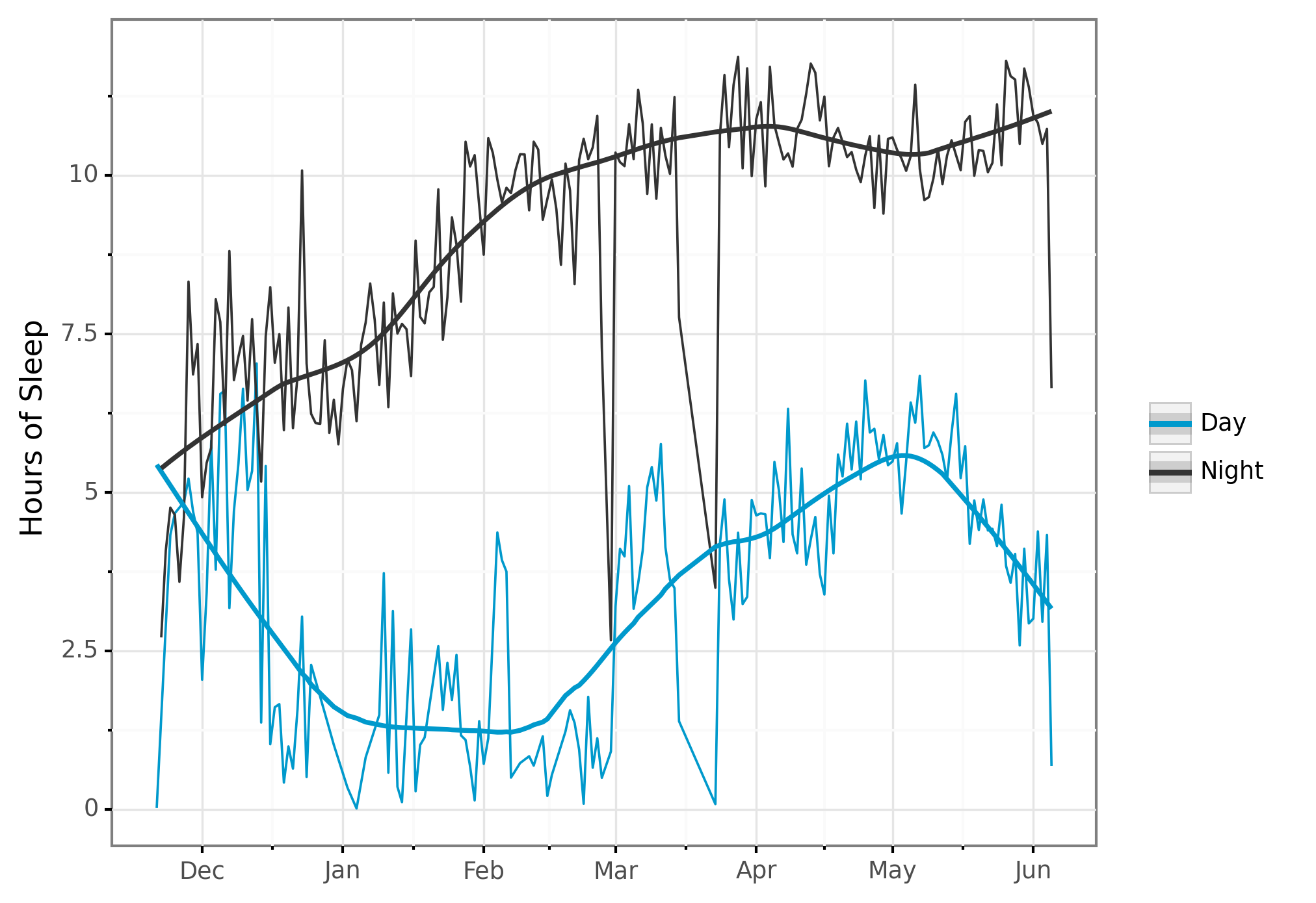
Sleep Time: Day vs. Night
# Aggregate days into daytime and nighttime sleep.
sleep_per_day = (df
  >> mutate(session_length = _.end_datetime - _.start_datetime)
  >> group_by(_.start_date, _.sleep_type)
  >> summarize(sleep_time = _.session_length.sum())
  >> mutate(sleep_hours = _.sleep_time /  np.timedelta64(1, 'h'))  # convert to hours
)
This is where I think siuba really shines. I have many sleep sessions for each day. My goal is to compute summary statistics for each day. In one statement, I:
- Add a column calculating sleep session length
- Group by day and type of sleep (day or night)
- Summarize these groups, calculating the total amount of sleep.
- Add another column expressing this as an integer instead of a timedelta.
Now let’s plot it, using plotnine:
# Plot amount of sleep per day, by daytime or nighttime.
plot_spd = (sleep_per_day >>
  ggplot(aes(x = "start_date", y = "sleep_hours",
             color="sleep_type", group = "sleep_type"))
  + geom_line()
  + scale_x_date(name="", date_labels="%b")
  + ylab("Hours of Sleep")
  + geom_smooth(span=0.3)
  + theme_bw()
  + scale_color_manual(values=COLOR_VALUES.hex_colors)
  + theme(subplots_adjust={'right': 0.85})  # Give legend 10% so it fits
  + guides(color=guide_legend(title=""))
)
print(plot_spd)
ggsave(
  plot_spd,
  "fig/lineplot_python_sleepperday_by_sleeptype.png",
  width=6.96, height=5.51, units="in", dpi=300
)
Here’s the resulting plot:
I love how easy it is to add a per-group trendline by simply adding + geom_smooth() to the plotting code.
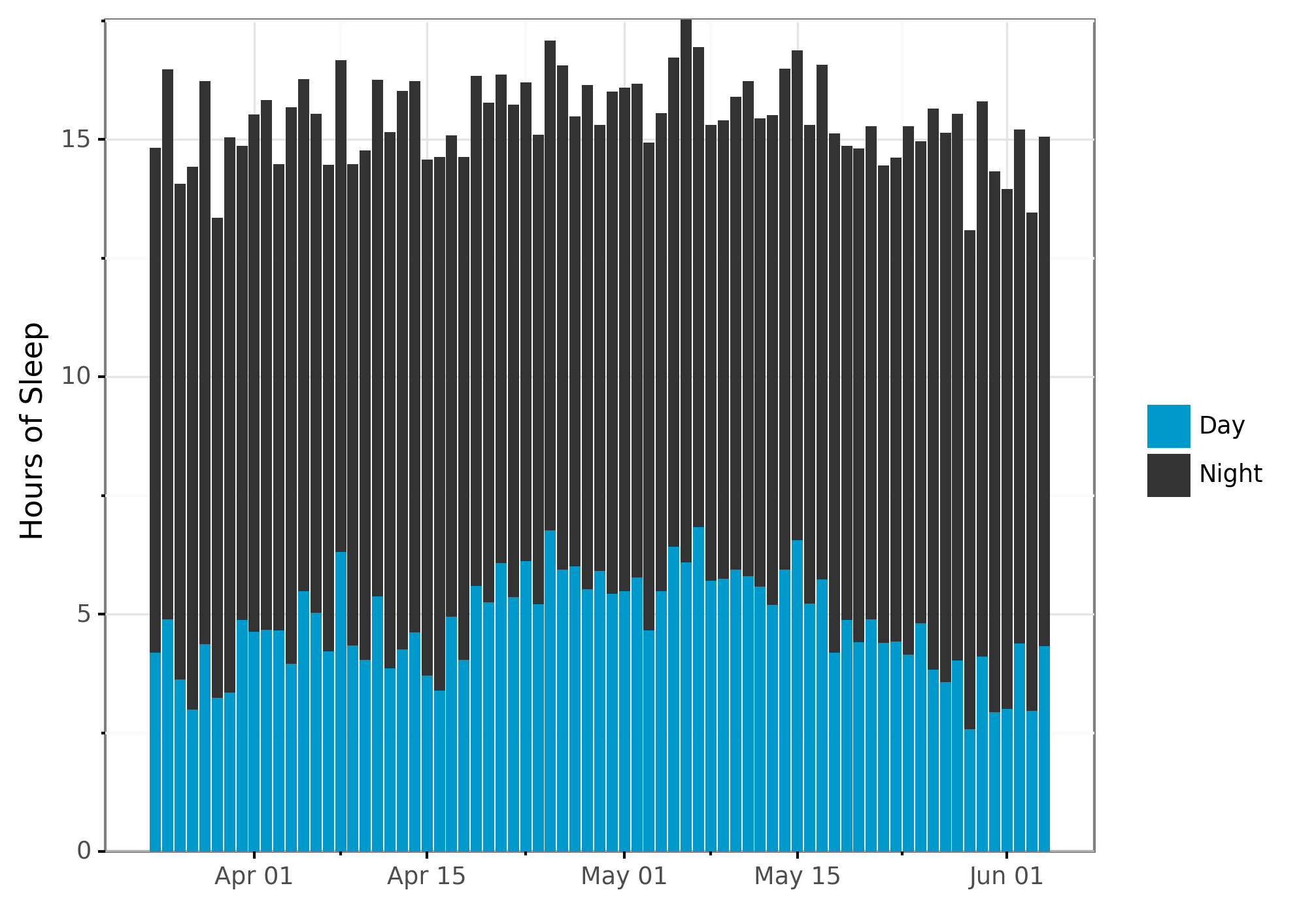
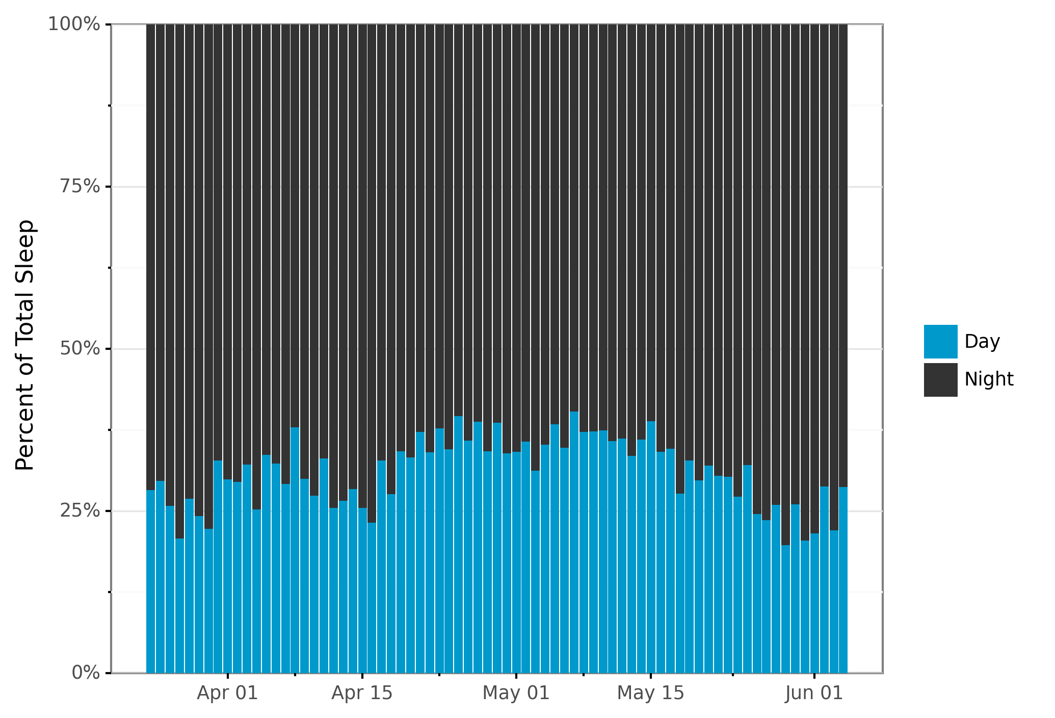
Proportion Spent Sleeping
Now for each day I calculate the percent of total sleep that is during the day or at night. Again, I can write this in one statement of chained together functions:
# Get total time sleeping per day.
sleep_per_day = (sleep_per_day >>
  # Filter to when the data is accurate.
  filter(_.start_date >= datetime.date(year=2020, month=3, day=24),
         _.start_date <  datetime.date(year=2020, month=6, day= 5)) >>
  group_by(_.start_date) >>
  mutate(sleep_proportion = _.sleep_hours / _.sleep_hours.sum()) >>
  ungroup()
)
I love getting the per-group summary of total sleep time and applying it to get within-group percentages. I’ve typically had to do this by doing some yucky joins with multiple dataframes in pandas (though I imagine there may be smoother ways now).
# Plot total time spent sleeping by night vs day.
plot_bar_day = (sleep_per_day >>
  ggplot(aes(x="start_date", y="sleep_hours", fill="sleep_type"))
  + geom_col(position = position_stack(reverse = True))  # Put night on top of day
  + scale_x_date(name="", date_labels="%b %d")
  + ylab("Hours of Sleep")
  + theme_bw()
  + scale_fill_manual(values=COLOR_VALUES.hex_colors)
  + theme(subplots_adjust={'right': 0.85})             # Give legend 10% so it fits
  + guides(fill=guide_legend(title=""), reverse=True)  # Reverse isn't implemented yet
  + scale_y_continuous(expand=(0, 0, 0, 0.0001))
)
print(plot_bar_day)
ggsave(
  plot_bar_day,
  "fig/barplot_python_by_sleeptype.png",
  width=6.96, height=5.51, units="in", dpi=300
)
# Plot proportion of time spent sleeping by night vs day.
plot_bar_pct = (sleep_per_day >>
  ggplot(aes(x="start_date", y="sleep_proportion", fill="sleep_type"))
  + geom_col(position = position_stack(reverse = True))  # Put night on top of day
  + scale_x_date(name="", date_labels="%b %d")
  + ylab("Percent of Total Sleep")
  + theme_bw()
  + scale_fill_manual(values=COLOR_VALUES.hex_colors)
  + theme(subplots_adjust={'right': 0.85})             # Give legend 10% so it fits
  + guides(fill=guide_legend(title=""), reverse=True)  # Reverse isn't implemented yet
  + scale_y_continuous(labels=lambda l: ["%d%%" % (v * 100) for v in l],  # % labels
                       expand=(0, 0, 0, 0.0001))       # No white margins on graphs
)
print(plot_bar_pct)
ggsave(
  plot_bar_pct,
  "fig/barplot_python_pct_sleeptype.png",
  width=6.96, height=5.51, units="in", dpi=300
)
Summary
Woof, this post was longer than I was hoping at the outset. For the Python programmers, hopefully you enjoyed this cursory glance into the world of R! For the R programmers, hopefully you saw how they tidyverse’s ideas are slowing moving into Python.
If you enjoyed this post, consider signing up for email updates in the menu on the left or following me on Twitter.