Recreating the 'Most Beautiful Data Visualization of All Time'
01 Jun 2020
This is part of a series on visualizing baby sleep data with Python and R. All code is in this repository.
- Visualizing Baby Sleep Times in Python
- Recreating the ‘Most Beautiful Data Visualization of All Time’
- Night and Day, Python and R: Baby Sleep Data Analysis with Siuba
Beautiful Baby Sleep
After I posted a plot of baby’s sleep times, someone on Twitter asked for a radial plot version. A friend pointed out that a radial plot of a baby’s sleep times was referenced in this Washington Post article, which claims “This is the most beautiful data visualization of all time, according to Reddit.” Clearly this is a case of a headline writer going nuts in search of those sweet, sweet clicks, as I think a more accurate headline would be “this is currently the most upvoted thing on r/dataisbeautiful”. Check out the reddit post here.
ANYWAY I have essentially the same data as that visualization, so I decided to take a whack at recreating it. Maybe I’ll even turn it into a clock, just like the reddit poster!
| Original | Mine |
 |
|
To make a good graph requires making lots of bad graphs. Ofentimes, we only see the final, beautiful result and we don’t see the experimentation and effort that got us there. To showcase this process a little bit, I’m going to break this post into two parts:
- Part 1 will show the iterative process to get to the final graph.
- Part 2 will walk through the final mechanics of how I made the plot, line by line.
If you want to see some of my experimentation, read part 1. If all you care about is looking at how I made the plot, you can skip to part 2.
I used R’s ggplot2 graphing library for this post.
My previous post used Python’s plotnine, but the crucial coord_polar is not ported as of this post’s writing.
My code for this post is available in this github repo.
Part 1: Iterative Exploration
Data
Assume we have a dataframe where each row contains the start time, end time, and date of a sleep session. It looks like this:
   start_date next_date  start_time end_time
 * <date>     <date>     <time>     <time>
 1 2019-11-21 2019-11-22 18:30:38   18:31:58
 2 2019-11-22 2019-11-23 04:03:32   05:07:27
 3 2019-11-22 2019-11-23 05:07:27   05:53:04
 4 2019-11-22 2019-11-23 05:53:04   05:54:07
Recreating a Linerange
In my previous post, I used the following Python code to create the plot:
(ggplot(aes(x="start_date",), data=rows)
  + geom_linerange(aes(ymin = "start_time", ymax = "end_time"))
  + scale_x_date(name="", date_labels="%b", expand=(0, 0))
  + scale_y_datetime(date_labels="%H:%M",
                     expand=(0, 0, 0, 0.0001))  # remove the margins
  + ggtitle("Baby Sleep Times")
  + theme_minimal()
  + theme(plot_background=element_rect(color="white"))  # white, not transparent
)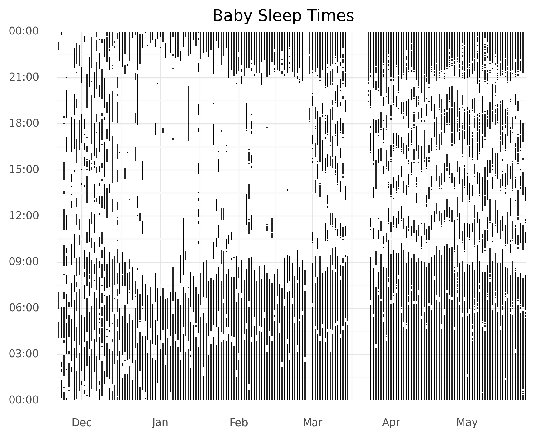
We can translate this to ggplot2 with really minor modifications! Here it is in ggplot2:
p <- ggplot(aes(x=start_date), data=rows)
  + geom_linerange(aes(ymin = start_time, ymax = end_time))
  + scale_x_date(name="", date_labels="%b", expand=c(0, 0))
  + scale_y_time(labels = function(x) format(as.POSIXct(x), format = '%H:%M'),
                 expand=c(0, 0, 0, 0.0001))
  + ggtitle("Baby Sleep Times")
  + theme_minimal()
Here are the two side-by-side:
Polar Coordinates
The (coord_polar)[https://ggplot2.tidyverse.org/reference/coord_polar.html] function transforms our graph to a polar coordinate system.
It changes our x axis to the angle, and sets the y axis to the radius.
It’s extremely easy to use– we can just add it the variable p that represents our plot, which we created in the codeblock above.
p + coord_polar(start = 0)The resulting plot:
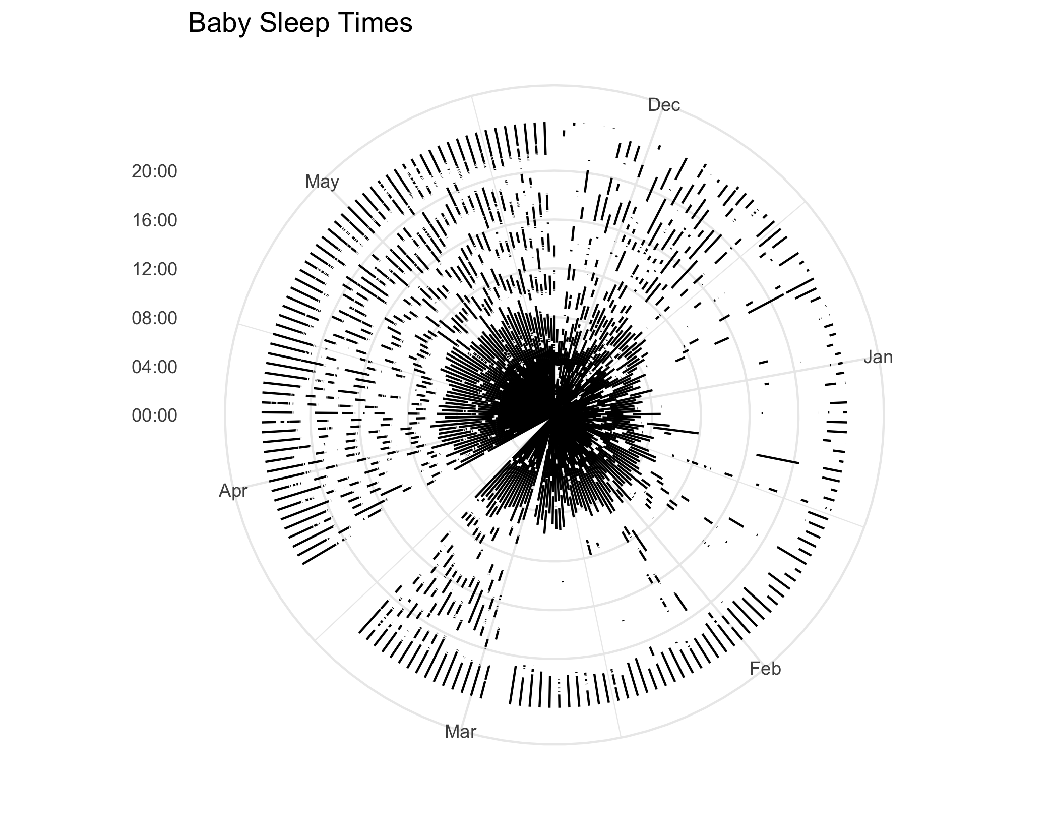
Hmm… comparing that to the reference image, that’s not what we want! It appears our axes our flipped: we want the time of day to be the angle, and the radius to be the day.
Flipping the Axes
While writing this post, I did something crazy: I actually looked at the documentation!
I realized I can change what variable is getting mapped to the angle by simply changing a parameter in coord_polar.
p + coord_polar(start = 0, theta = "y")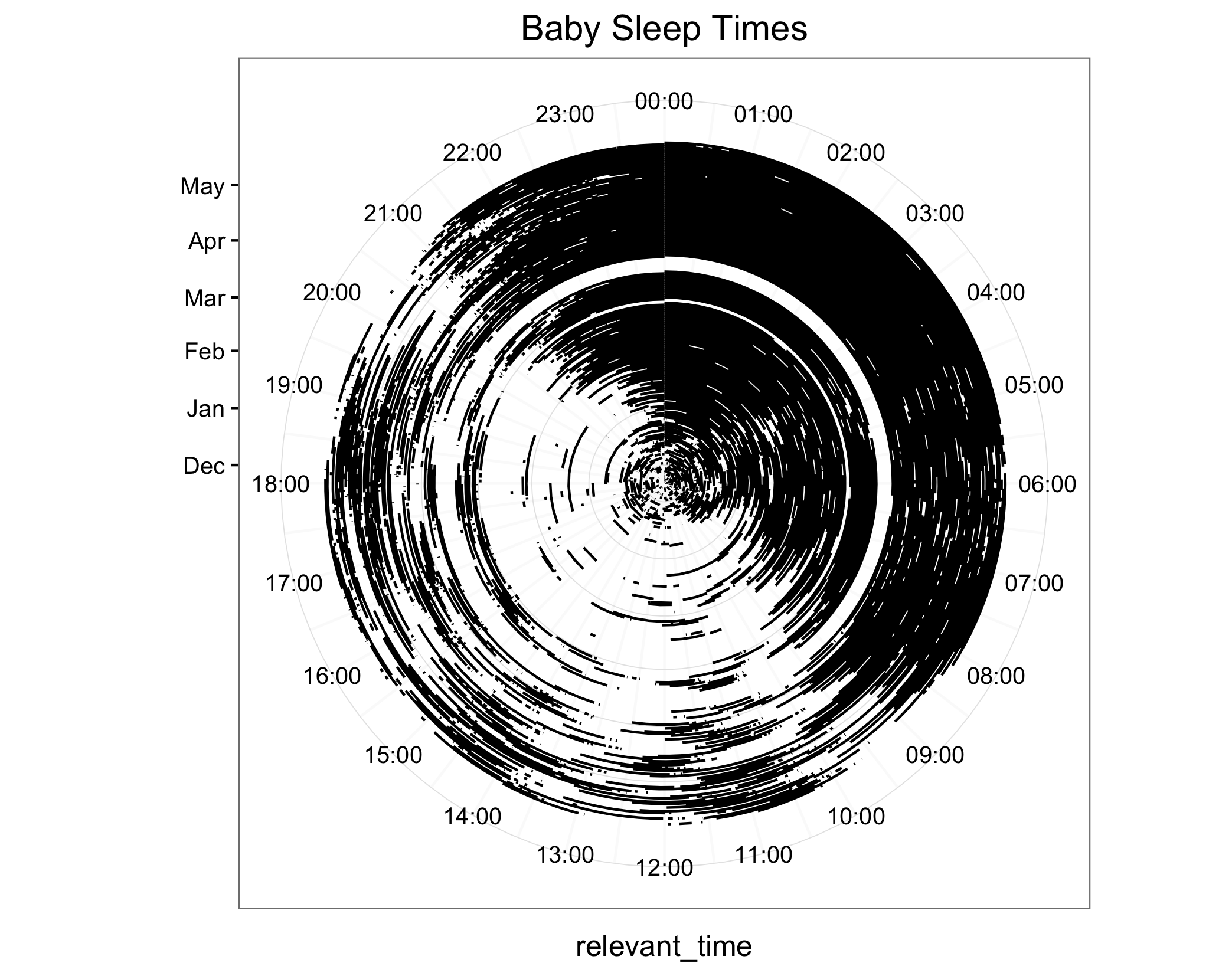
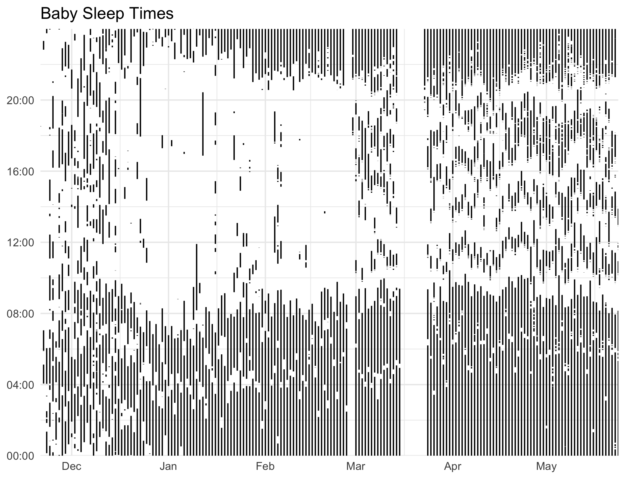
When I was actually making the plot, I first flipped the axes, changing x to y and vice versa.
It would be kind of a pain to use geom_line for this, and ultimately the Reddit plot looks to use blocks of color, not lines of color, to represent sleep times, so I also changed geom_linerange to geom_rect.
p2 <- ggplot(aes(), data = rows)
    + geom_rect(aes(xmin = start_time, xmax = end_time,
                    ymin = start_date, ymax = next_date,))
    + scale_y_date(name="", date_labels="%b", expand=c(0, 0))
    + scale_x_time(expand=c(0, 0, 0, 0.0001))
    + ggtitle("Baby Sleep Times")
+ theme_minimal() 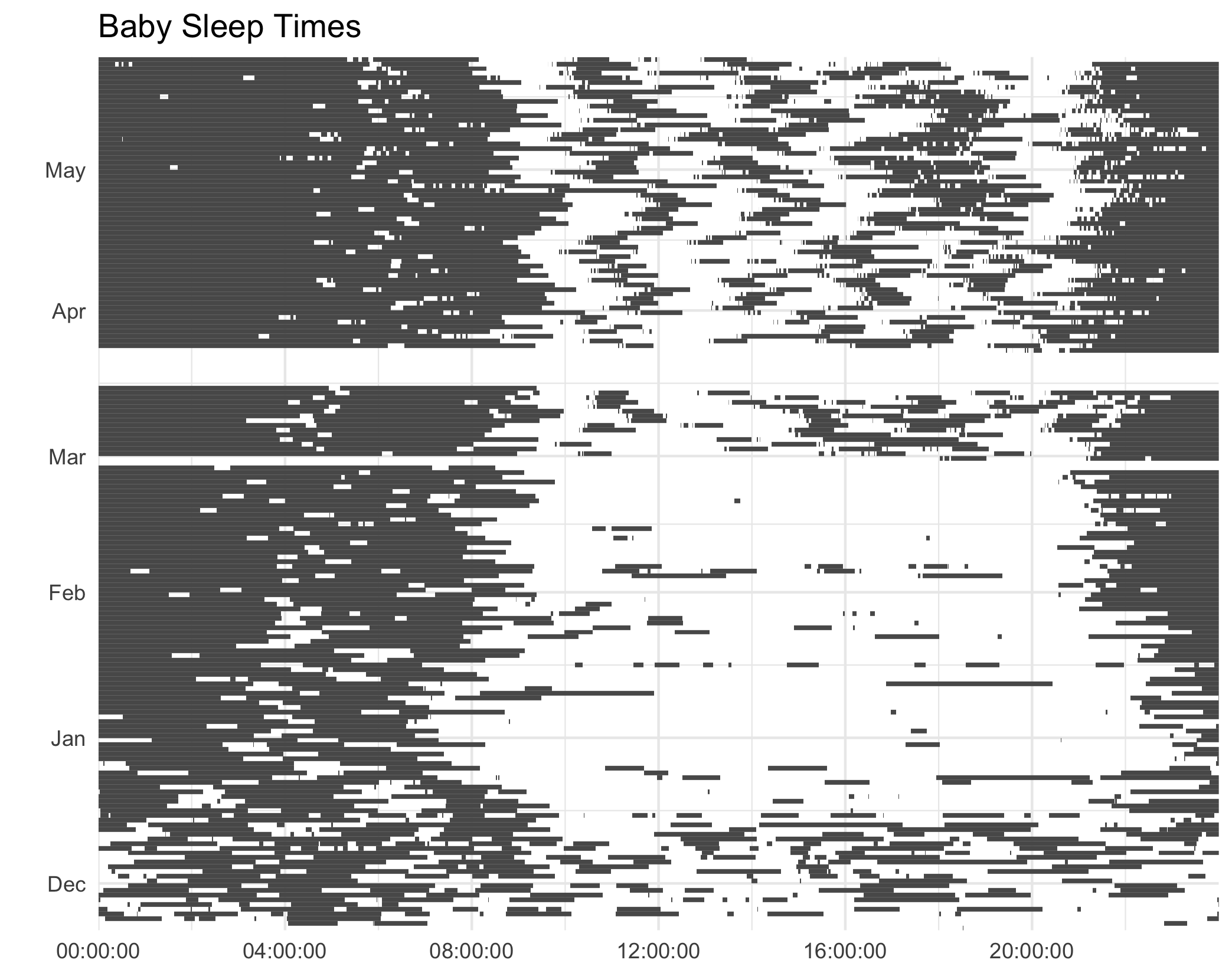
And here it is in polar coordinates:
p2 + coord_polar()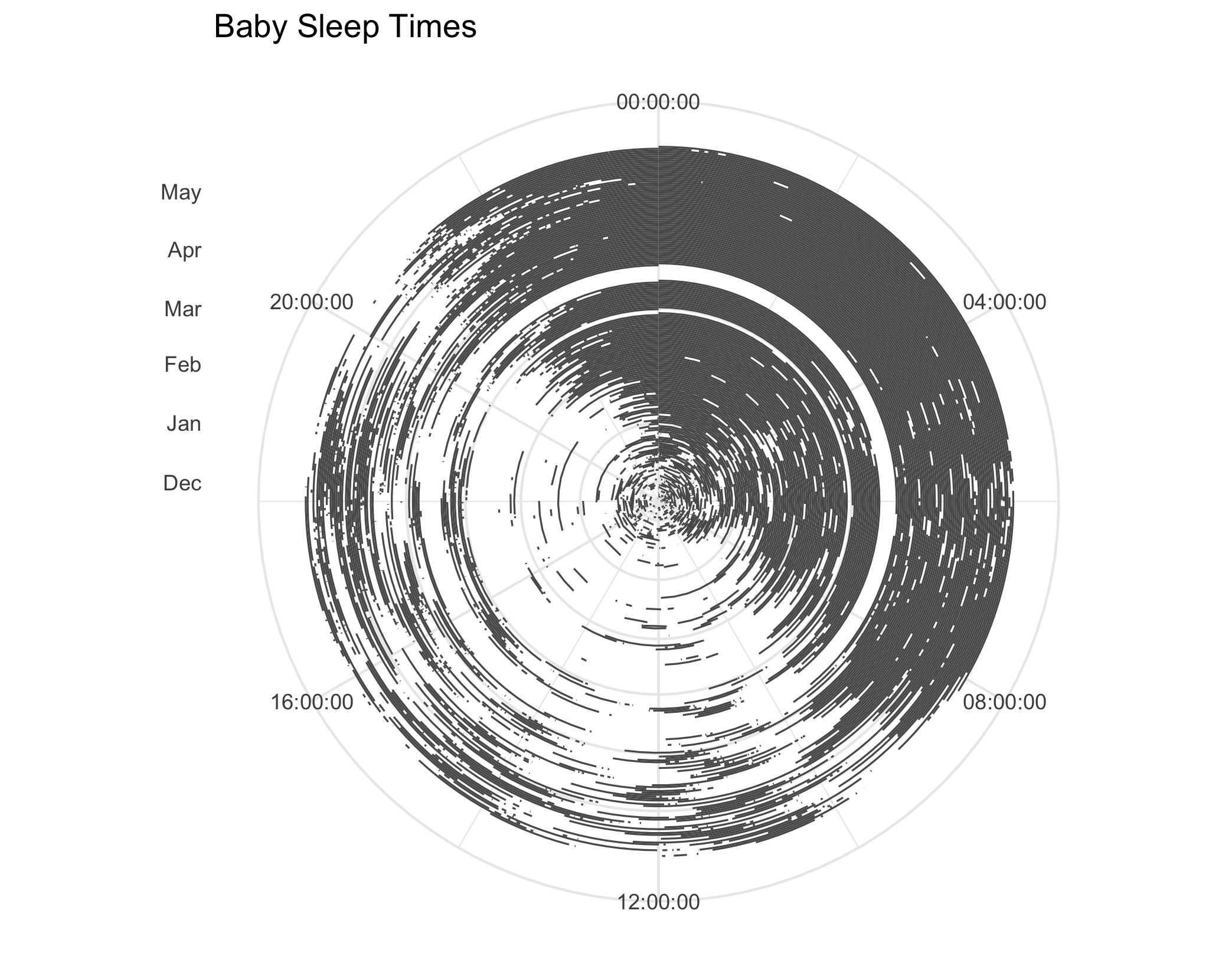
At this point, I realized that my current data representation had a flaw: in addition to a row for the times my baby was asleep, I also needed the inverse, rows for all the times my baby was awake. I’ll now walk through how I made that, along with the code for the final graph.
Part 2: Coding the Graph Walkthrough
Read and Manipulate Data
First, we read in our original dataset. We’ll then add awake times, which will simply be all the times between sleep sessions.
# Read in data.
df <- read_csv("all_snoo_sessions.csv")

# Add rows for when baby is awake, the inverse of when baby is asleep.
df <- df %>%
  select(-duration, -asleep, -soothing) %>%
  mutate(session_type = "asleep")
inverse_df <- df %>%
  arrange(start_time) %>%
  mutate(
    start_time_new = end_time,
    end_time_new = lead(start_time),
    session_type = "awake",
    start_time = start_time_new,
    end_time = end_time_new
  ) %>%
  select(-start_time_new, -end_time_new) %>%
  filter(!is.na(start_time) & !is.na(end_time))

# Combine the "awake" and "asleep" rows.
df <- rbind(df, inverse_df) %>% arrange(start_time)
Break Sessions Into Days
Next, to deal with sessions that cross day boundaries, we’ll simply break any row that crossing midnight into 2 sessions, one that ends at midnight and one that starts at midnight. We did this in the previous Python code as well, but I recreate it here in R.
# Break up sessions that cross the midnight boundary into two sessions,
# one pre-midnight and one-after midnight, so that all sessions only take place
# in one day.
df_no_cross <- df %>%
  filter(date(start_time) == date(end_time)) %>%
  mutate(
    start_date = date(start_time),
    next_date = start_date + days(1),
    start_time = hms::as_hms(start_time),
    end_time = hms::as_hms(end_time))

df_cross <- df %>% filter(date(start_time) != date(end_time))
df_cross_1 <- df_cross %>%
  mutate(
    start_date = date(start_time),
    next_date = start_date + days(1),
    start_time = hms::as_hms(start_time),
    end_time = hms::as_hms("23:59:59")
  )
df_cross_2 <- df_cross %>%
  mutate(
    start_date = date(end_time),
    next_date = start_date + days(1),
    start_time = hms::as_hms("00:00:00"),
    end_time = hms::as_hms(end_time)
  )

# Combine dataframes.
rows <- rbind(
  df_no_cross,
  df_cross_1,
  df_cross_2
)
Get the Colors!
To match the colors of the reddit graph, I used OSX’s Digital Color Meter, which shows you the color values in hex of any pixels on your screen. Really easy to use!
# Create custom colors, pulled from original plot via OSX's Digital Color Meter.
color_awake <- rgb(248/256, 205/256, 160/256)
color_sleep <- rgb(63/256, 89/256, 123/256)
Create the Plot
Finally, after lots of experimentation, I created the plot using ggplot2.
# Create radial plot
(rows %>%
  filter(start_date <= "2020-05-20") %>%
  ggplot(aes(x=start_date), data=.)
+ geom_linerange(aes(ymin = start_time, ymax = end_time, color = session_type))
+ scale_x_date(name="", date_labels="%b", expand=c(0, 28))    # Add margin on circle interior.
+ scale_y_time(expand=c(0, 0, 0, 0.0001))                     # Remove margin.
+ scale_color_manual(values = c(color_sleep, color_awake))    # Custom colors
+ theme_void()                                                # Remove most axes.
+ coord_polar(theta = "y")                                    # Apply polar coordinates.
+ theme(legend.position = "none")                             # Remove legend.
)
Ultimately I found that using geom_rect created some weird aliasing effects.
You can see these in the original image from reddit, where some “waves” show up on the blue parts.
After some experimentation, I found that geom_linerange and saving as an SVG produced a cleaner image.
theme_void is useful for truly minimalist plots, but I still needed to write an extra line to remove the legend.
It’s easy to add custom colors in with scale_color_manual.
I added a little extra margin on the interior of the circle to match the style of the plot on reddit.
Conclusion
This post hopefully gave some insight into the process of creating a plot through a process of iterative experimentation.
I learned some neat tricks while writing it, like coord_polar and Mac’s built-in Digital Color Meter.
I think this plot is very beautiful, but I find the Cartesian plots to be a bit more informative and easy to read. The radial plot “spends” way more pixels on more recent data, and makes it harder to see older data. For this dataset, if you’re going for informative over aesthetically plesing, it’s reasonable to stick with a more standard plot.
If you have other plots you’d be curious to see, or questions you want answered, leave a comment.