Same Stats, Different Graphs
11 Mar 2018Back in May of 2017 a really cool image appeared in my Twitter feed. Here it is:
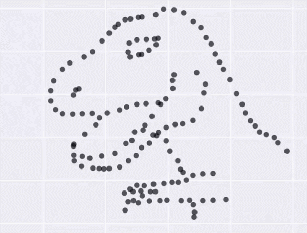
The image is even cooler than just the cool moving dots, but to understand why, I have to discuss a tiny bit of stats and a tiny bit of computer science.
(If you already know all about simulated annealing, Anscombe’s quartet, and just want some code to generated datasets with identical summary statistics, check out my github project)
Anscombe’s Quartet
Suppose I show you the descriptive statistics of four different datasets, and they looked like this:
| Dataset | mean x | std dev x | mean y | std dev y | correlation | linear regression line |
|---|---|---|---|---|---|---|
| Dataset 1 | 9 | 11 | 7.50 | 4.12 | 0.816 | y = 3 + 0.5x |
| Dataset 2 | 9 | 11 | 7.50 | 4.12 | 0.816 | y = 3 + 0.5x |
| Dataset 3 | 9 | 11 | 7.50 | 4.12 | 0.816 | y = 3 + 0.5x |
| Dataset 4 | 9 | 11 | 7.50 | 4.12 | 0.816 | y = 3 + 0.5x |
They all look pretty similar, right?
But when you plot them, they actually look extremely different.

This is a famous dataset called “Anscombe’s Quartet,” named after the English statistician Frank Anscombe. The existence of this dataset is an argument to not just run summary statistics, but try to get to know your data better before using it to make decisions. Plot it, make histograms, look for repeated values, etc.
Two researchers from Autodesk, Justin Matejka and George Fitzmaurice, took this idea and cranked it up to 11.
Simulated Annealing
After thinking about Anscombe’s quarter, the two Autodesk researchers wondered if they could construct wildly different looking graphs with the same summary statistics. It’s unknown how exactly Anscombe created his quartet. Matejka and Fitzmaurice wondered if they could computationally generate different datasets that looked wildly different but statistically identical. And by wildly different, we’re talking the different between a point cloud and a dinosaur.
I highly encourage you to read the paper from Autodesk, which you can check out here. It’s only four pages long and very clear, with a great motivation and a nice description of their algorithm and extensions.
To create different datasets, they rely on a technique called simulated annealing, which I’ll briefly explain. In data science, whenever we try to solve a problem, we first try to figure out a way to describe it mathematically. A lot of the time this means describing something we want to maximize (or minimize). For example, we may want to maximize the number of sales, votes, or lives saved. Usually, we’ll have some inputs to the system, like advertising budget, political leanings of potential voters, or medical test results. If the relationship between the inputs and the output is a “smooth” function, it can be relatively easy to find a solution, but if it’s not, it can be tougher.
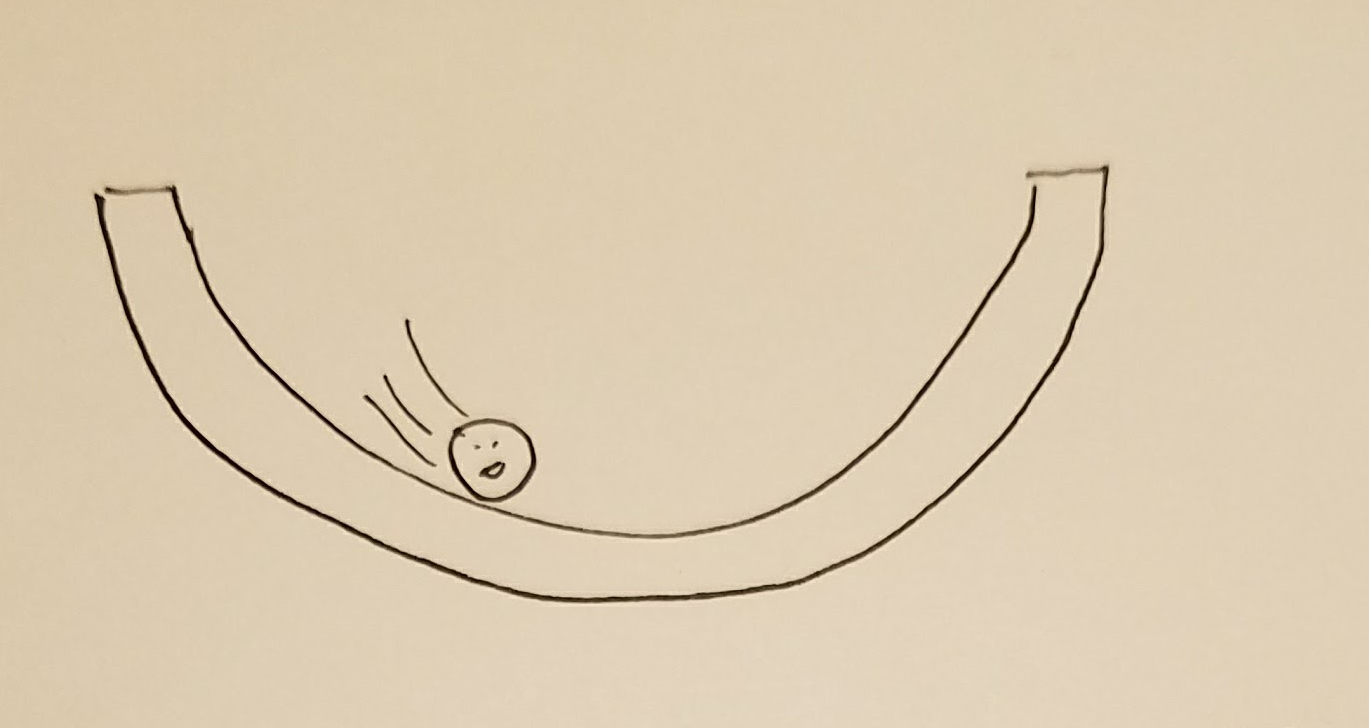
Here’s a rough analogy: imagine you want to find the lowest point in a bowl.
If the bowl has a typical shape, you could just drop a marble in it, and the marble would quickly roll to the lowest point.
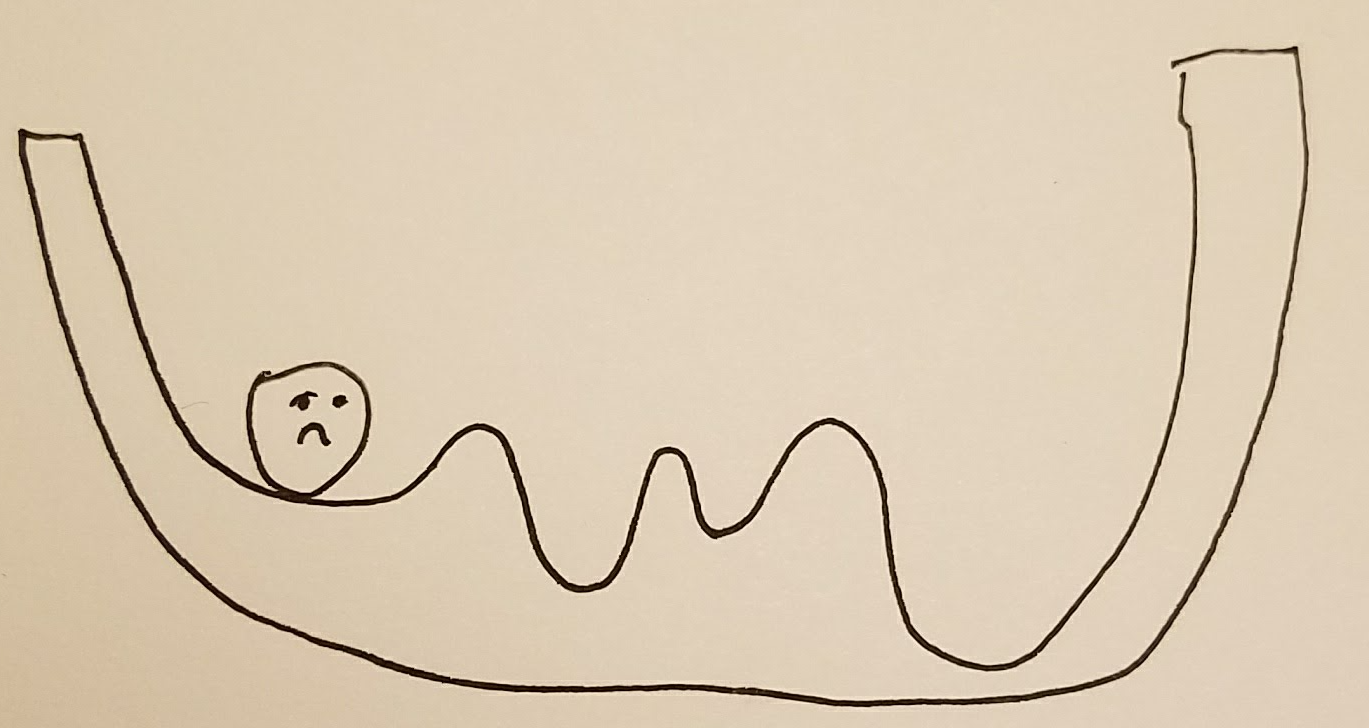
 However, if the bowl has a crazy bumpy bottom, dropping a marble in it will no longer work.
That’s where simulated annealing comes in.
I won’t get into the full details, but let’s extend our analogy a bit to explain how it works.
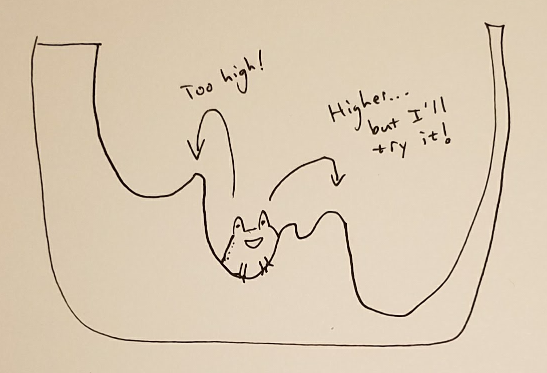
Instead of using a marble to find the lowest point inside the bowl, we now enlist our good pal, Hoppy the toad.
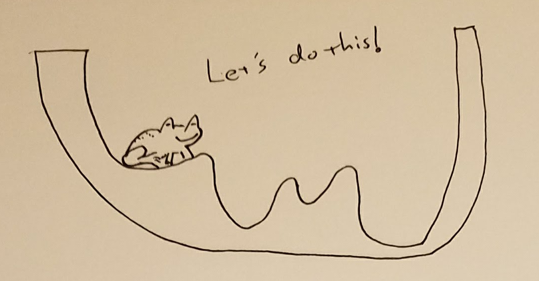 We’re going to place Hoppy in the bowl and he’s going to hop around (as toads do), looking for the lowest spot.
Here’s how:
Wherever he is, Hoppy will keep track of how low he is.
When he hops to a new spot, if he ends up higher than where he just was, he’ll hop back to the lower spot.
However, in the interest of exploring more of the bowl, every once in a while he’ll stay in a new spot even if it’s higher.
We’re going to place Hoppy in the bowl and he’s going to hop around (as toads do), looking for the lowest spot.
Here’s how:
Wherever he is, Hoppy will keep track of how low he is.
When he hops to a new spot, if he ends up higher than where he just was, he’ll hop back to the lower spot.
However, in the interest of exploring more of the bowl, every once in a while he’ll stay in a new spot even if it’s higher.
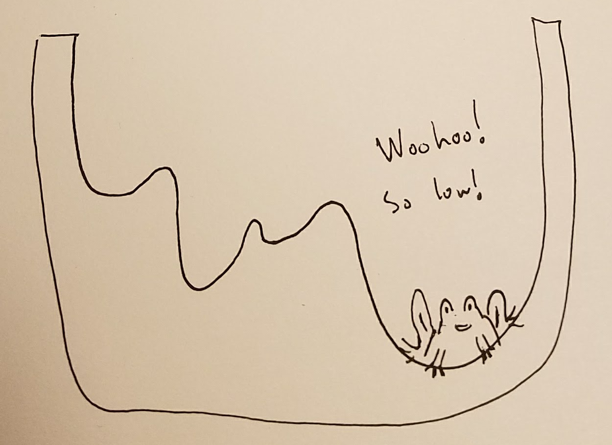
 As the process goes on, we’ll tell Hoppy to not explore these higher places as much.
The hope is that over time, Hoppy will find a point that’s very low, possible the lowest point.
As the process goes on, we’ll tell Hoppy to not explore these higher places as much.
The hope is that over time, Hoppy will find a point that’s very low, possible the lowest point.
And that is my toad-infused explanation of simulated annealing.
Implementation
A cool thing about simulated annealing is that it’s pretty simple to code.
I decided to give this a swing, and I wrote up a github package in Python that does this, so you too can make different graphs with the same stats.
You can easily create datasets or even gifs that show the transformations.
Just give it a git clone and the make_dataset_cmd.py has pretty good internal documentation.
Run make_dataset_cmd.py --help or email me / open a github issue if you run into trouble and I’ll happily respond.
Here’s the pseudo code from the paper:
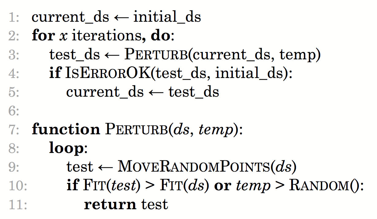
And the core of my code that does this looks like:
for i, temp in enumerate(temperatures):
  test_ds = Perturb(current_ds, target, temp)
  if IsErrorOk(test_ds, initial_ds):
    current_ds = test_ds

def Perturb(ds, target, temp, scale=0.1):
  for i in range(1000):
    # Move a random point
    rand_idx = np.random.randint(len(ds))
    old_point = ds[rand_idx, :]
    new_point = old_point + normal(scale=scale, size=2)

    if (temp > np.random.random()
          or Fitness(new_point, target) > Fitness(old_point, target)):
      out = ds.copy()
      out[rand_idx, :] = new_point
      return out
  print("failed to pass")
  return ds

def constraint(old, new):
  """Constraint: first two decimal places remain the same"""
  return math.floor(old*100) == math.floor(new*100)

def IsErrorOk(test_ds, initial_ds):
  return (
    constraint(test_ds[:, 0].mean(), initial_ds[:, 0].mean())
    and constraint(test_ds[:, 1].mean(), initial_ds[:, 1].mean())
    and constraint(test_ds[:, 0].std(), initial_ds[:, 0].std())
    and constraint(test_ds[:, 1].std(), initial_ds[:, 1].std())
  )
(The full code is here)
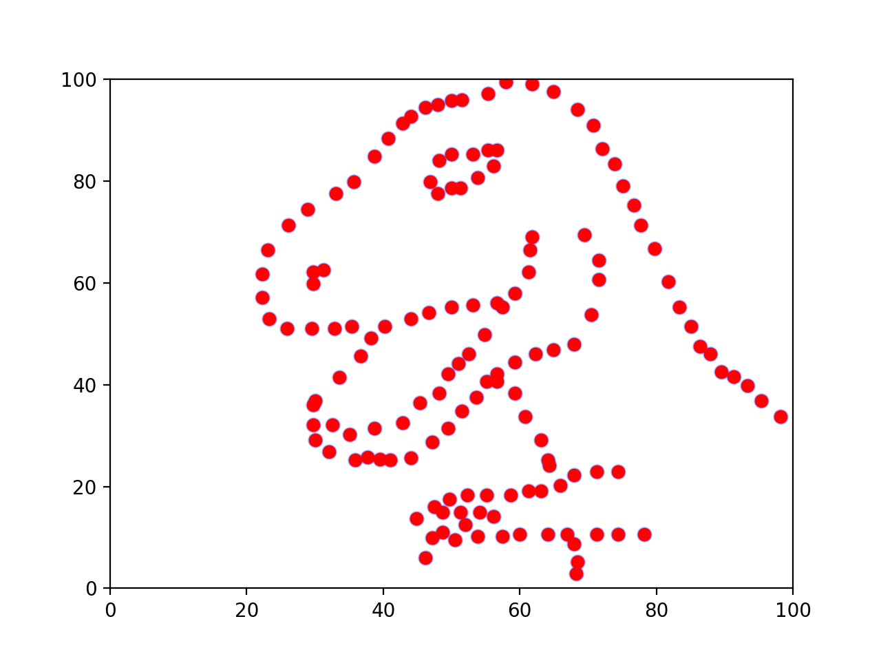
And here’s an image I made with my package.
Final thoughts
I see something neat, think to myself “Wow, that’s so cool, and it should only take me a few hours to do!” and then three years later I finally complete it.
You know what’s extra funny? I wrote that sentence almost a year ago, back in May of 2016… I had basically the code done and the blog post finished and just didn’t get it out the door. A good reminder to just say “screw it; ship it.”
One other thought: for those who know more about it, I tried running some other optimization techniques, like describing the problem as an LP. It didn’t work great for a few reasons: (1) you don’t get the fun intermediate steps that make for a good animation, and (2) some of the solutions from this technique looked off, with many points on the exact same point and a few other points moved to fit the summary statistics constraint.
Interested? Disgusted? Hungry? Write a comment or shoot me an email and I’ll respond.