Visualizing Baby Sleep Times in Python
26 May 2020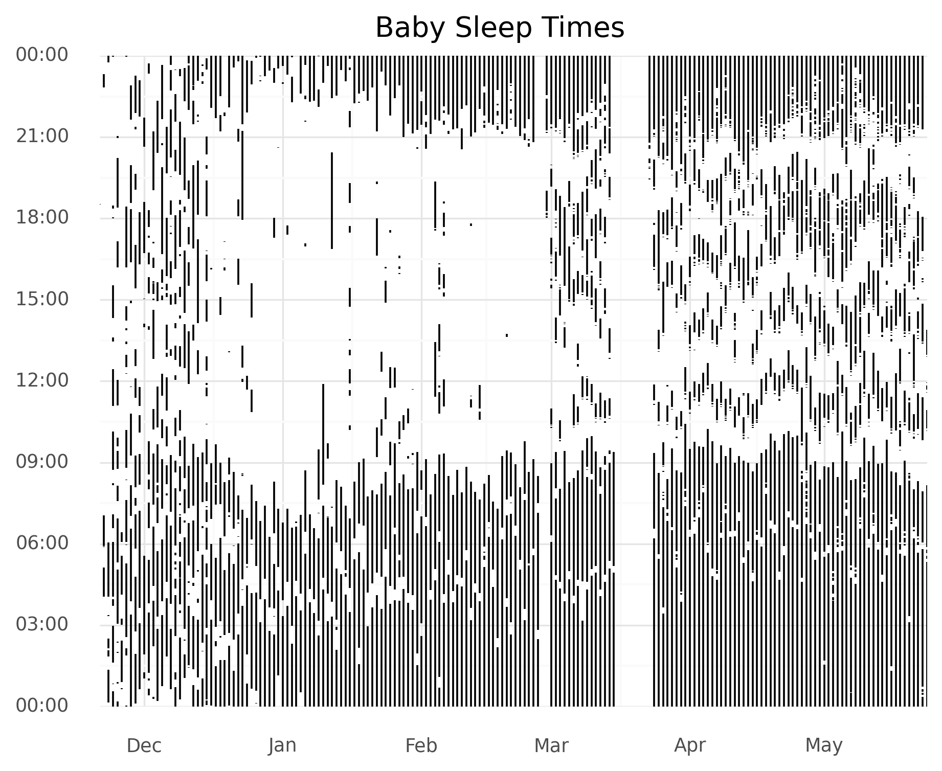
This is part of a series on visualizing baby sleep data with Python and R. All code is in this repository.
- Visualizing Baby Sleep Times in Python
- Recreating the ‘Most Beautiful Data Visualization of All Time’
- Night and Day, Python and R: Baby Sleep Data Analysis with Siuba
Baby Sleep Data
My baby sleeps in a fancy bassinet that records her sleep times. I wanted to see how her sleep patterns have trended over time, going from soul-crushing randomness to the more pleasant actually-sleeping-most-of-the-night schedule. Additionally, I wanted to take the plotnine plotting library for a spin.
All of the code is this repository.
Preliminaries
First we have some imports.
I always break my imports into built-ins, installed packages, and local modules.
In this case I am using no local modules, just the built-in datetime and the installed pandas and plotnine.
import datetime

import pandas as pd
from plotnine import *
Generally, using from [package] import * is frowned upon, but this is a quick analysis, not production code, and it makes our plotting code way cleaner.
Data Download and Load
Next up, a bash command to get the data out of the fancy bassinet, followed by reading it into a pandas DataFrame.
# first, run
# pip install snoo
# snoo sessions --start START_DATE --end END_DATE > all_snoo_sessions.csv
df = pd.read_csv("all_snoo_sessions.csv")
Data Processing
Out data looks like this:
In [207]: !head all_snoo_sessions.csv
start_time,end_time,duration,asleep,soothing
2019-11-21T18:30:38,2019-11-21T18:31:58,80,80,0
2019-11-22T04:03:32,2019-11-22T05:07:27,3835,2422,1413
2019-11-22T05:53:04,2019-11-22T05:54:07,63,36,27
Let’s turn that into something a little more sensible.
I decided I wanted to plot date on the x-axis and the time of day on the y-axis.
I’ll have a vertical line with end points for the start and end of a sleep session.
The datetimes include both dates and times (wow, dates and times in a datetime!) so we’ll have to break them apart.
Pandas .dt accessor is great here– it allows you to use the standard library datetime methods on a Pandas series in parallel.
# Break out dates and times.
df["start_datetime"] = pd.to_datetime(df["start_time"])
df["end_datetime"] = pd.to_datetime(df["end_time"])
df["start_time"] = df["start_datetime"].dt.time
df["end_time"] = df["end_datetime"].dt.time
df["start_date"] = df["start_datetime"].dt.date
Now we run into a tricky issue: what about sleep sessions that span days? There might be some plotting magic that can handle that, but I decided to simply break into two any sleep session that crossed a day boundary. I did this a few ways, but I think the following approach is easiest to understand and code.
First, I separate out sessions into those that cross midnight and those that don’t. We don’t need to do anything about the former and can set that data aside.
For sessions that do cross midnight, we make two copies. For the first, we set the end date to just before midnight. For the second, we set the start time to midnight, and increment the date to be the next day. If this doesn’t make sense, I encourage you to take a few data points and try it out. Finally, we combine these dataframes into one new dataframe, which we’ll use for plotting.
# Deal with sessions that cross day boundaries.
df_no_cross = df[df["start_datetime"].dt.day == df["end_datetime"].dt.day].copy()
df_cross = df[df["start_datetime"].dt.day != df["end_datetime"].dt.day]
df_cross_1 = df_cross.copy()
df_cross_2 = df_cross.copy()
df_cross_1["end_time"] = datetime.time(hour=23, minute=59, second=59)
df_cross_2["start_date"] = df_cross_2["start_date"] + datetime.timedelta(days=1)
df_cross_2["start_time"] = datetime.time(hour=0, minute=0, second=0)


# Combine dataframes
rows_no_cross = df_no_cross[["start_date", "start_time", "end_time"]]
rows_cross_1 = df_cross_1[["start_date", "start_time", "end_time"]]
rows_cross_2 = df_cross_2[["start_date", "start_time", "end_time"]]
rows = pd.concat([rows_no_cross, rows_cross_1, rows_cross_2])
Plotting with plotnine
I’m a huge fan of ggplot2, a graphing library for R.
Whenever I do any plotting in Python, I’m always just sad that I’m not using ggplot2.
People have tried to clone it before and I’ve found those clones lacking.
I gave it another whirl with plotnine, a new ggplot2 clone.
So far, I’m really pleased.
Everything has Just Worked™!
The plotting code will be very clear for ggplot2 fans… if you don’t understand it, it’s out of scope for this post, but I Strongly Encourage you to look up ggplot2 and play with it!
# Convert back to datetime so plotnine can understand it
rows["start_time"] = pd.to_datetime(rows["start_time"], format='%H:%M:%S')
rows["end_time"] = pd.to_datetime(rows["end_time"], format='%H:%M:%S')

# Make the plot.
plot = (ggplot(aes(x="start_date",), data=rows)
  + geom_linerange(aes(ymin = "start_time", ymax = "end_time"))
  + scale_x_date(name="", date_labels="%b", expand=(0, 0))
  + scale_y_datetime(date_labels="%H:%M",
                     expand=(0, 0, 0, 0.0001))  # remove the margins
  + ggtitle("Baby Sleep Times")
  + theme_minimal()
  + theme(plot_background=element_rect(color="white"))  # white, not transparent
)

# Save it!
ggsave(plot, "fig/lineplot_python.png", width=6.96, height=5.51, units="in", dpi=300)
Summary and Comments
I should note that there’s clearly some missing data in the image. We didn’t track lots of naps, and a few days have no data at all. That said, some clear patterns emerge. During the first few days, sleep is all over the place, but gradually settles into a routine. Later, nighttime wake-ups become fewer and shorter.
In terms of the coding work, plotnine worked great, and I look forward to using it in more projects. As with most things in life, some small tweaks took the most time. In particular, I messed around with the timestamp formatting a lot and spent LOTS of time Googling to figure out how to remove some margins, which I found particularly ugly.